Lorem Ipsum for Designers: Placeholder That Won't Mislead
Lorem ipsum helps designers judge rhythm, density and hierarchy before real words exist, but only if the filler behaves like the copy that will replace it. Tune three things: sentence length (short, medium or long), structure (headings between paragraphs, or bullet lists) and language (Latin for internal critiques, realistic English for clients). GrabCast's Lorem Ipsum Generator controls all three and pastes cleanly into Figma, Sketch, Canva or a code prototype. This guide is for visual and product designers who want mockups that survive contact with real content. It covers matching filler to the voice of a brand, testing type measure and rag, presenting to stakeholders without derailing the meeting, and the moment to retire dummy text for proto-content.
📜 Try the Lorem Ipsum Generator now — freeOpen →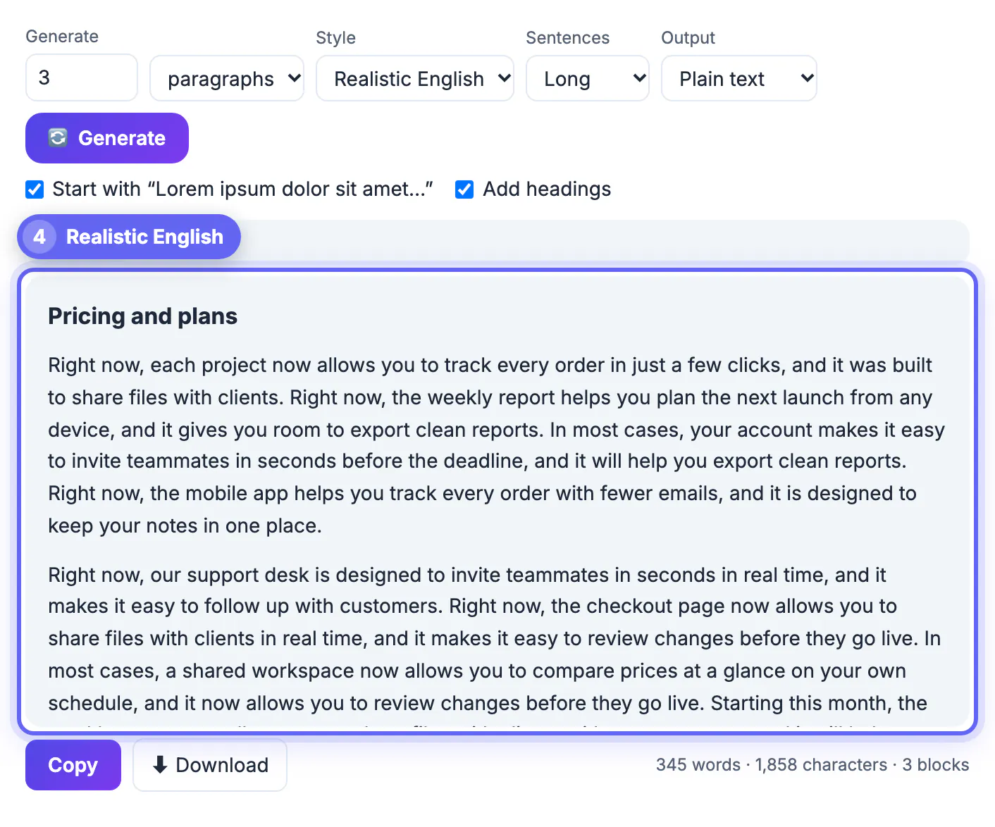
Default dummy text is statistically polite. Every paragraph is about the same length, words are short and even, and nothing ever runs long, so every card, column and hero block looks balanced. Real copy is lumpy: a punchy two-line intro on one page, a dense legal paragraph on the next, a product name three times longer than the rest. A layout approved against polite filler tends to break the week actual content arrives, when changes are most expensive. Shaping the filler to resemble the brand's real writing, short and snappy for a consumer app or long and formal for a law firm, gives a much more honest picture of how the page will feel.
Match the filler to the voice of the real copy
Before generating anything, look at two or three pages the client has already published and note how they write.
- Consumer apps and retail brands write short, punchy lines. Set Sentences to Short, roughly 5 to 9 words each in Latin mode, so your hero and feature blocks feel equally brisk.
- Editorial sites, universities and professional services write longer sentences. Long gives about 14 to 24 words per sentence and a denser texture that tests paragraph spacing.
- Medium, 8 to 15 words, is the safe default for product pages and blog templates when you have no examples yet.
- Each paragraph contains three to five sentences, so regenerating a few times gives naturally uneven blocks for a grid of cards.
Test type measure, rag and hierarchy with dummy text
Filler is most useful for decisions about typography, which do not depend on meaning at all.
- Measure: aim for about 45 to 75 characters per line in body text. Paste three paragraphs and count a typical line, or generate exactly 65 characters to size a column.
- Rag: a ragged right edge with deep holes looks careless. Long sentences in Latin expose bad hyphenation and short-word pileups quickly.
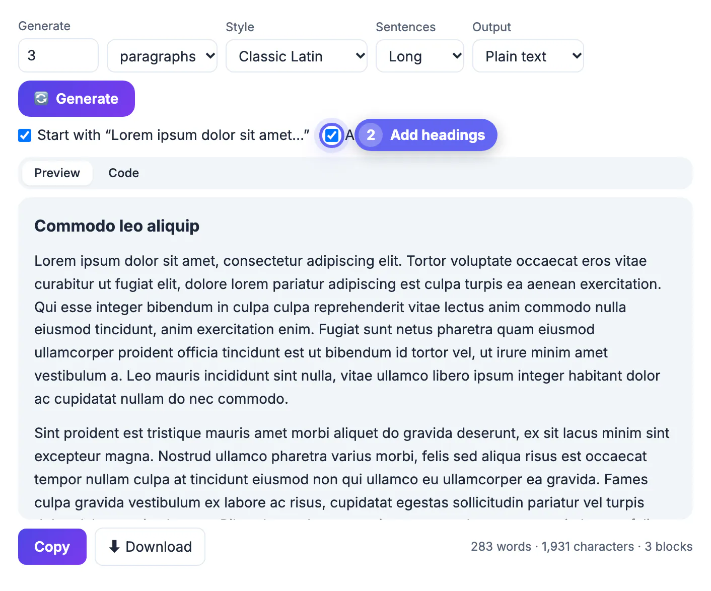
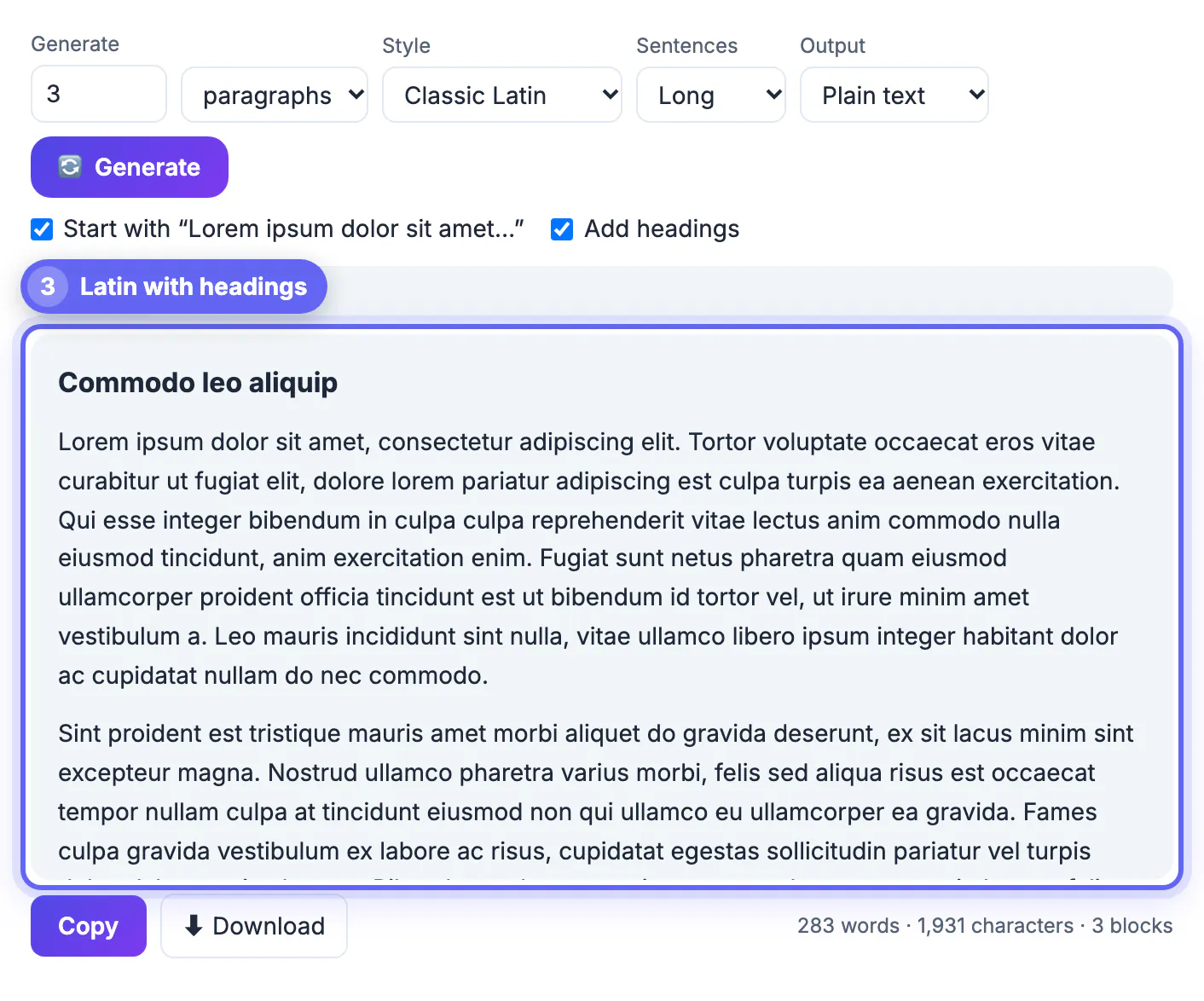
- Hierarchy: tick Add headings to get a heading before every second paragraph, then check spacing above and below each level of heading.
- Lists: switch the unit to list items for feature bullets, and compare Short and Long to decide between one-line bullets and wrapped ones.
Test hierarchy with legibility in mind: the Thumbnail Legibility Checker shows how text holds up when small, and the Color Blindness Simulator checks colour choices.
Presenting placeholder copy to clients and stakeholders
Latin keeps design reviews on layout, but it can backfire with people outside the design team.
- Clients unfamiliar with the convention ask what the Latin means or worry the site will launch in another language. That eats the first ten minutes of the meeting.
- Realistic English generates plausible, generic product sentences, such as the onboarding flow was built to plan the next launch. People read them as copy-shaped without mistaking them for final text.
- Label placeholder regions in the file, for example with a colored note or a layer name like copy-TBD, so nobody signs off on words that were never written.
- For usability tests, use neither. Participants cannot judge a task they cannot read, so write real draft copy for anything a tester must understand.
From lorem ipsum to proto-content before handoff
Dummy text belongs to the sketch stage. As soon as a block has a purpose, replace it with proto-content: draft copy at realistic length and structure.
- Ask the client for three real examples of each content type, including the longest and shortest, such as product names, bios or prices.
- Design empty and error states with real wording, since those screens are always missed when everything is filled with Latin.
- Search your design file for lorem, ipsum and dolor before handoff, and ask developers to add the same search to their build checks.
- Check the places where stray filler hides: alt text, meta descriptions, social share previews and email templates.
Step-by-step
Common mistakes to avoid
Pro tips
Frequently asked questions
Should designers still use lorem ipsum?
Yes, for early wireframes and typography decisions where meaning would distract. Replace it with realistic proto-content once each block's purpose is known.
Can I make lorem ipsum sentences shorter or longer?
Yes. The Sentences setting offers Short, Medium and Long, from roughly 5 to 9 words up to 14 to 24 words per sentence in Latin mode.
Is there a lorem ipsum alternative that reads like English?
Yes. Set Style to Realistic English for generic app and marketing sentences that look like copy without being final text.
How do I paste lorem ipsum into Figma?
Generate the text, click Copy and paste it into a text layer. Plain text output keeps paragraphs separated by blank lines.
What is proto-content?
Draft copy written at realistic length and structure, such as a believable product name, price and review, used to test a design before final copy exists.
Treat lorem ipsum as a typographic sketching tool: match its sentence length and structure to the brand, switch to realistic English for clients, and move to proto-content as soon as blocks have a job. Then search for every leftover before the file leaves your hands.
Related guides
Browse more: all text and developer guides · the Lorem Ipsum Generator