YouTube Thumbnail Blurry or Unreadable on Mobile? Fixes
When a YouTube thumbnail looks blurry or unreadable on mobile, the cause is usually one of five things: the image is under 1280 x 720, it is not 16:9 so YouTube crops it, the text is too long and thin for a phone-sized tile, the colors lack contrast, or the key words sit under the length badge. The GrabCast YouTube Thumbnail Checker tests all five on your own file, in your browser. Below, a weak 960 x 720 draft for a fictional baking channel is diagnosed and rebuilt.
🖼️ Try YouTube Thumbnail Checker now — freeOpen →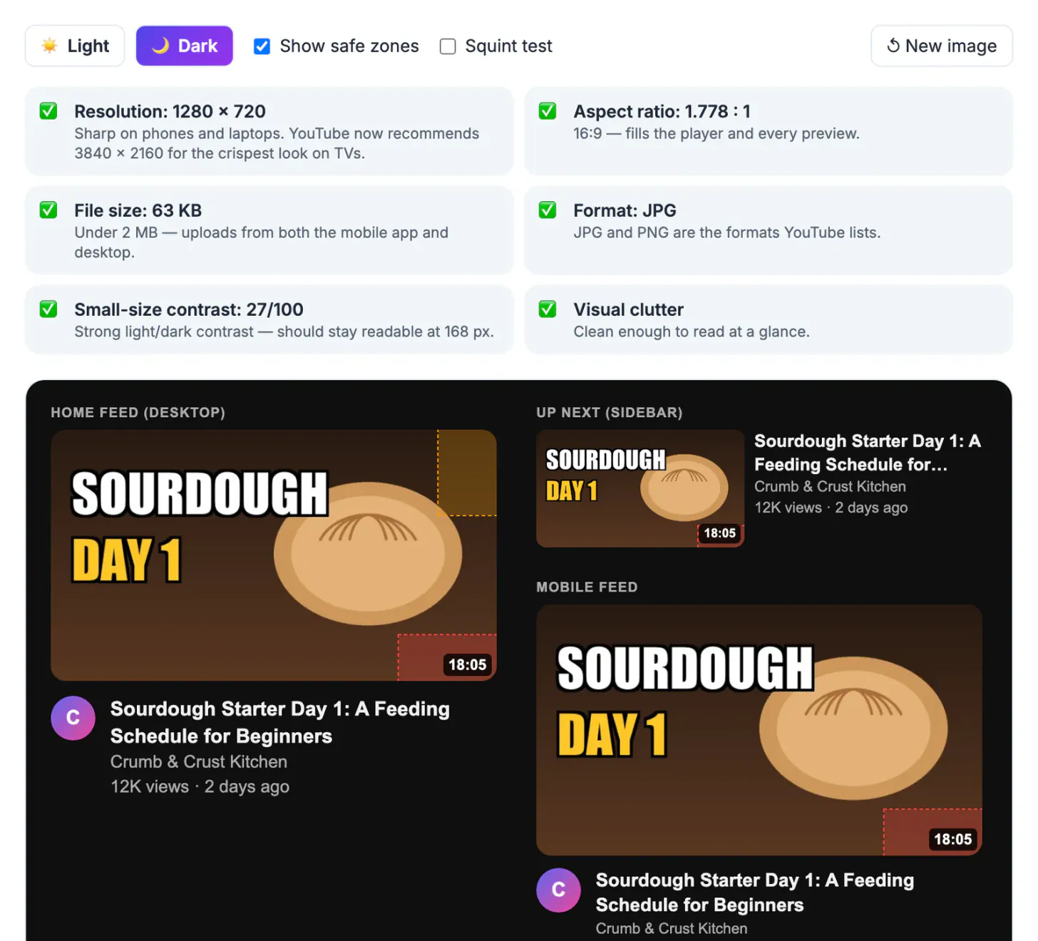
You design at full size, zoomed in, with the whole image filling a large screen. Viewers see it as a small tile beside other videos, often in a feed they scroll quickly. At that size thin letters merge, subtle color differences flatten and anything near the edges may be cropped or covered. The fixes are simple once you can see the problem at the right size, which is why checking before you publish beats changing the image after the video has already stalled.
Blurry from low resolution or heavy compression
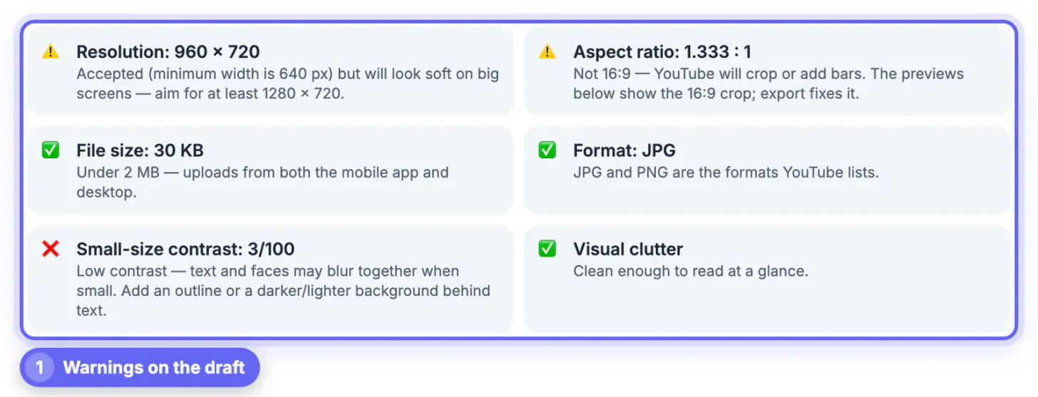
The draft in the example is 960 x 720. The checker accepts it, since YouTube's minimum width is 640, but warns that it will look soft and suggests at least 1280 x 720.
- Export at 1280 x 720 or larger straight from the design file; do not upscale a small copy.
- Avoid screenshots of your design app; export the actual canvas.
- Do not save a JPG over and over while editing; each save loses a little detail. Keep a layered master.
- Very low JPG quality settings smear text edges. When a file is too heavy, reduce texture before you reduce quality.
The checker's own export draws from your original at 1280 x 720, 1920 x 1080 or 3840 x 2160 and only steps JPG quality down as far as needed to stay under the size limit. A soft image can also come from the photo inside the design: a video frame grabbed from your own footage at 720p and enlarged to fill a 1920 pixel canvas will stay soft however you export it, so shoot a still or use a sharper frame.
Text cut off because the image is not 16:9
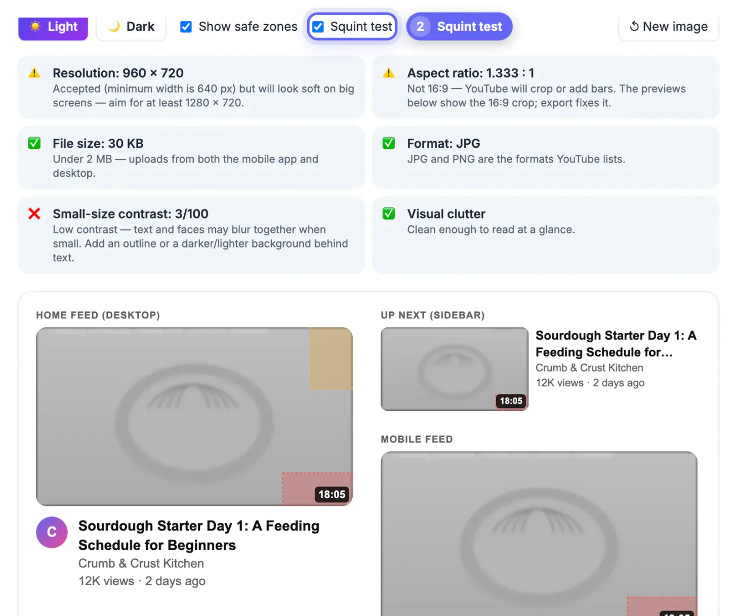
The draft is 4:3, a ratio of 1.333 to 1. YouTube shows every video cover at 16:9, so a 4:3 image loses strips from the top and bottom. In the checker's previews the draft's two-line title at the top and its Day 1 of 14 caption at the bottom are cropped away entirely, leaving a loaf of bread and no words.
- Rebuild the design on a 16:9 canvas, such as 1280 x 720, instead of stretching the old one.
- If you cannot redesign, the export's Fit with blurred background keeps the whole 4:3 image and fills the sides with a blurred copy.
- Crop to fill (center) is the other export option; it keeps the middle and cuts the edges, as YouTube would.
- Keep important words away from the outer tenth of the frame even at 16:9.
The aspect ratio row in the checker names the problem directly: Not 16:9, YouTube will crop or add bars. The file size row, by contrast, passed at 30 KB, a reminder that a light file says nothing about whether the design works.
Unreadable on mobile: small text and low contrast
Phones show the image large in the main feed, but the Up next list shrinks it to about 168 pixels wide, and a long line of regular-weight type turns to noise. The draft's contrast score was 3 out of 100, flagged with a red cross: beige letters on a beige loaf on a beige background.
- Cut the text to two or three words. The title under the image already carries the details.
- Use a heavy, condensed font and make letters fill a large share of the height.
- Put light text on a dark area, or the reverse, and add a dark outline or shadow behind the letters.
- Switch on the Squint test: it blurs the previews and removes color so you judge contrast alone.
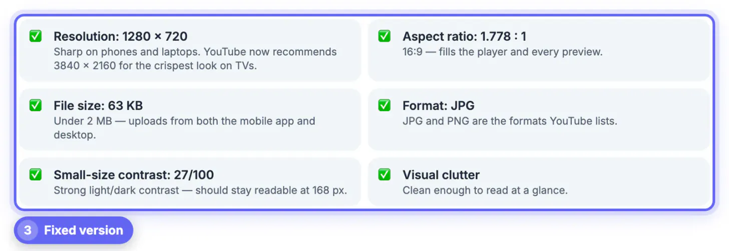
The rebuilt version uses SOURDOUGH in white and DAY 1 in yellow, both outlined in black, on a dark brown background. It scored 27 out of 100 and passed with Strong light and dark contrast.
Test small-size readability with the Thumbnail Legibility Checker, and text colors with the Color Contrast Checker.
Hidden words under the badge, and the dark-mode check
The length badge sits in the bottom-right corner of every tile. Anything there, including the draft's Day 1 of 14 caption, is covered even when the crop does not remove it. With Show safe zones on, the checker shades that corner red and the desktop hover strip orange.
- Move dates, prices and episode numbers to the top left or center.
- Keep faces and product close-ups out of the red corner as well.
- Switch the previews to Dark: dark-edged designs can blend into the dark page, so add a lighter border area if they disappear.
- Type your real title, channel and length so the mockups match your actual listing.
In dark mode the fixed version stays readable in every preview, including the smallest Up next card, and the red corner holds only the badge. If a fix still fails one row, change one thing at a time and reload it with New image, so you know which edit made the difference.
Step-by-step
Common mistakes to avoid
Pro tips
Frequently asked questions
Why does my video cover look blurry on YouTube?
Usually it is below 1280 x 720, was upscaled from a smaller copy, or was saved repeatedly as JPG. Export fresh from your design file at 1280 x 720 or larger.
Why is the text at the top of my image cut off?
The image is not 16:9, so it is shown cropped to that shape. Rebuild on a 16:9 canvas or use the checker's Fit with blurred background export.
What does the Squint test do?
It blurs the previews and turns them gray, so you can see whether the words still stand out when color and detail are gone.
What does the contrast score mean?
It measures light and dark variation in the image at 168 pixels wide. It is a rough signal, not text recognition, so still look at the previews yourself.
Can I check a Shorts cover?
Not accurately. Shorts use a vertical 9:16 frame, and these mockups preview 16:9 images for regular videos, so a Shorts cover needs its own check inside the YouTube app.
Most blurry or unreadable covers come from a small or non-16:9 file, too many thin words, low contrast or text under the badge. Rebuild at 1280 x 720 on a 16:9 canvas with two or three bold, outlined words, then confirm every check passes in light and dark mode before you upload.
Related guides
Browse more: all video and audio guides · YouTube Thumbnail Checker