Fonts for Text on Photos: Serif, Script or Condensed?
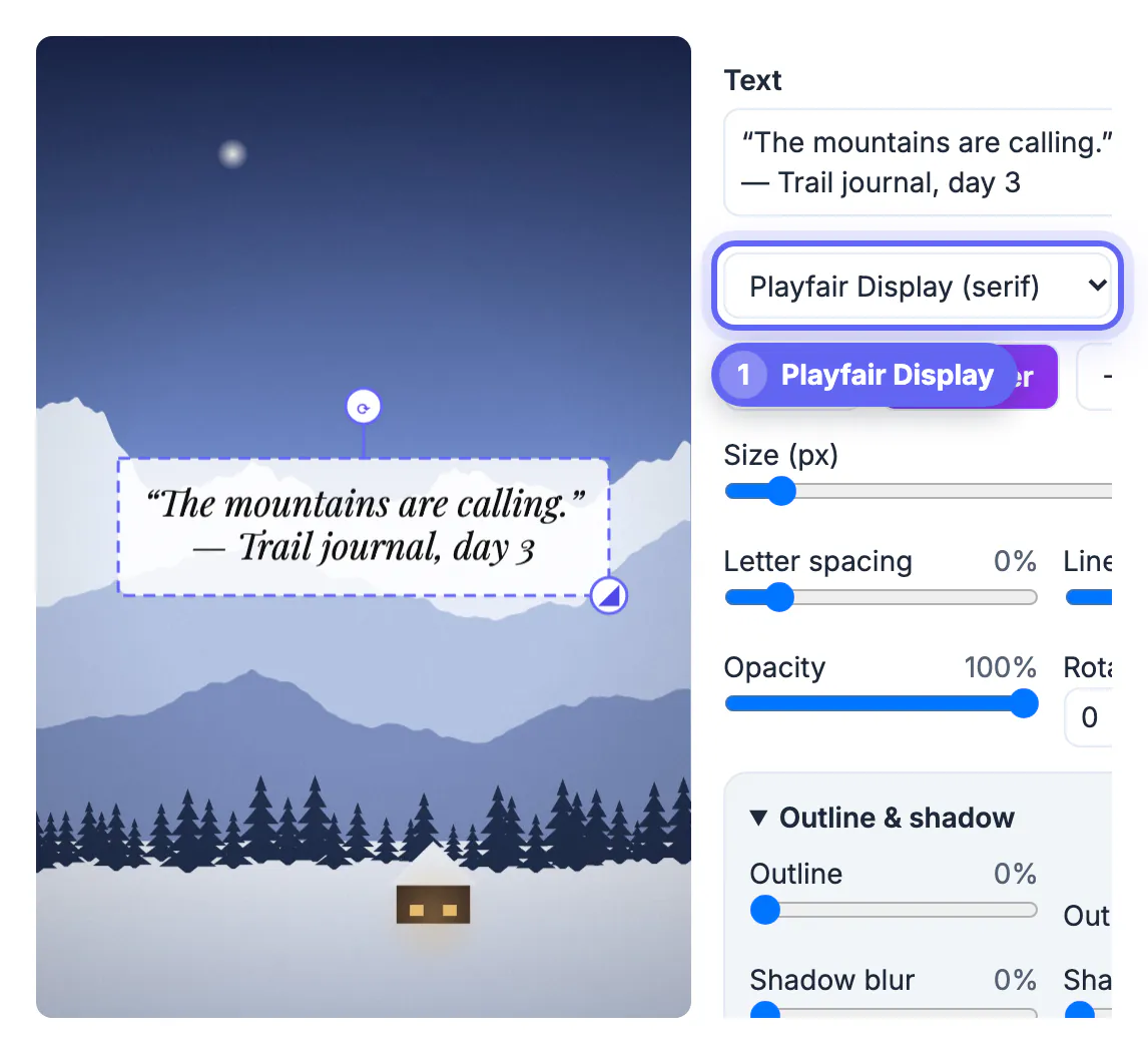
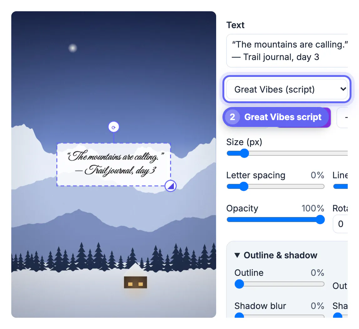
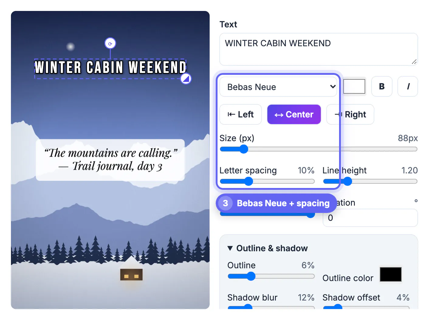
The best fonts for text on photos are chosen by job: a tall condensed or heavy sans such as Bebas Neue, Anton or Oswald for short headlines, a clean sans such as Inter or Montserrat for details and captions, a serif such as Playfair Display or Lora for quotes, and a script such as Great Vibes only for a few large words. Two fonts per image is plenty. GrabCast Add Text to Image offers 16 fonts across those styles, and we used them on a snowy mountain photo: a quote in italic Playfair Display on a light box, the same quote in Great Vibes to compare legibility, and a WINTER CABIN WEEKEND headline in Bebas Neue with 10 percent letter spacing. This guide sorts the available fonts by purpose, explains which pairs work, gives size and spacing starting points and covers export.
🔤 Try Add Text to Image now — freeOpen →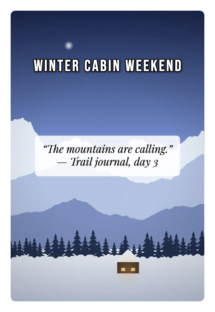
A font sets the tone before anyone reads a word. Heavy condensed capitals feel urgent and sporty, a high-contrast serif feels literary or elegant, handwriting feels personal, and a neutral sans feels informative. Choosing against the message creates friction: a funeral notice in a bouncy script or a sale banner in a delicate serif. Fonts also behave differently on photos. Thin hairlines and swashes disappear on textured backgrounds and at small sizes, while wide heavy letters take space you may not have. Picking a font for its job, and limiting yourself to two, gives images a deliberate look without any design training.
The 16 fonts for text on photos, sorted by job
The font menu in Add Text to Image groups naturally into five families of use.
- Clean sans for captions and details: Inter and Montserrat. Montserrat has bold and italic; both stay readable at small sizes.
- Condensed and heavy for headlines: Bebas Neue, Oswald, Anton and Archivo Black. They fit many letters into a narrow width and work best in capitals.
- Serif for quotes and elegant titles: Playfair Display, Merriweather and Lora, each with bold and italic styles.
- Casual display: Lobster, Pacifico and Permanent Marker for playful, retro or hand-lettered looks; Caveat for a handwriting feel.
- Formal script: Great Vibes, Sacramento and Allura for invitations and short greetings.
- Fonts cover accented Latin letters; characters from other scripts fall back to a system font, so check the preview.
Pairing two fonts on one image
Contrast in style, harmony in mood: that is the whole rule for pairs.
- Condensed caps plus serif italic: Bebas Neue for the headline and Playfair Display for a quote, as in our WINTER CABIN WEEKEND example. Tall, spaced capitals and a flowing italic never compete.
- Heavy sans plus clean sans: Anton for an event name and Montserrat for date and place, the classic flyer pair.
- Script plus sans: Great Vibes for a name or greeting, Inter for the details underneath.
- Avoid two scripts, two different condensed fonts or two serifs; similar fonts look like a mistake rather than a choice.
- Use size and color for emphasis within one font before adding a third font.
Sizes and spacing that suit each style
Size is set in pixels of the original photo, so the same number looks smaller on a large image.
- Condensed caps look best with a little air: letter spacing of 5 to 15 percent. We used 10 percent at 88 pixels on a 1067 x 1600 photo.
- Serif quotes read well at a line height around 1.2 to 1.4; the Quote preset sets italic Playfair Display on a white box at 85 percent opacity.
- Scripts need size. In our test Great Vibes at the same size as the serif quote became noticeably harder to read, with thin strokes that blur when the image is shown small.
- Bold helps sans fonts on busy photos, but not every font has a bold style; single-weight fonts such as Anton or Bebas Neue are already heavy.
- Give scripts and thin serifs a box or a shadow, since outlines clog their fine strokes.
Check readability with the Color Contrast Checker and the Thumbnail Legibility Checker before you export.
Previewing and exporting your font choices
What you see is what you download, because each font is loaded before the image is rendered.
- Fonts load on demand when you pick them, so the first switch may take a moment on a slow connection.
- Switch fonts on the selected layer and compare; Undo and Redo keep up to 100 steps, so nothing is lost.
- Check the Layers list for order: our headline sat above the quote layer, and the arrows change which one is drawn on top.
- PNG keeps text edges perfectly crisp, but photos become large; our 1067 x 1600 image was 1.91 MB. JPG at 85 to 92 is far smaller with little visible difference.
Step-by-step
Common mistakes to avoid
Pro tips
Frequently asked questions
What is the best font for text on a photo?
It depends on the job. Condensed capitals such as Bebas Neue or Anton suit headlines, clean sans fonts such as Inter or Montserrat suit details, and serifs such as Playfair Display suit quotes.
How many fonts should I use on one image?
Two at most: one for the headline or quote and one for supporting text. Vary size and color before adding a third font.
Why is my script font hard to read?
Script letters have thin connecting strokes that blur at small sizes and on busy backgrounds. Make the text larger, keep it short and place it on a box or calm area.
Which fonts does the tool offer?
Sixteen: Inter, Montserrat, Oswald, Anton, Archivo Black, Bebas Neue, Playfair Display, Merriweather, Lora, Lobster, Pacifico, Permanent Marker, Caveat, Great Vibes, Sacramento and Allura.
Will the downloaded image use the same font as the preview?
Yes. The tool waits for every chosen font to load before rendering the full-size image, so the download matches the preview.
Pick fonts by job, not by mood alone: condensed caps for headlines, clean sans for details, serif for quotes and script only when large and short. Pair two contrasting fonts, add spacing to capitals, check legibility small and export PNG for crisp edges or JPG for smaller files.
Related guides
Browse more: all image guides · Add Text to Image