Readable Text on Busy Photos: Outline, Shadow or Box?
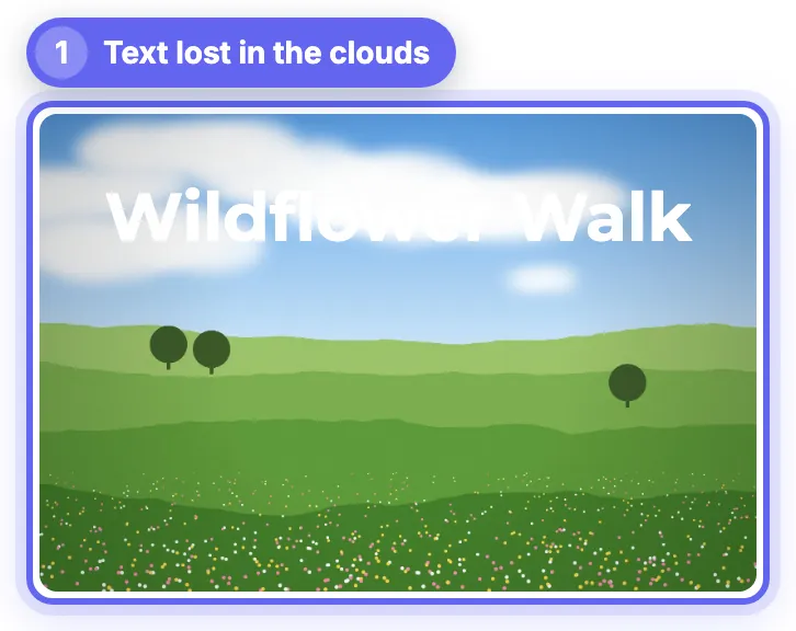
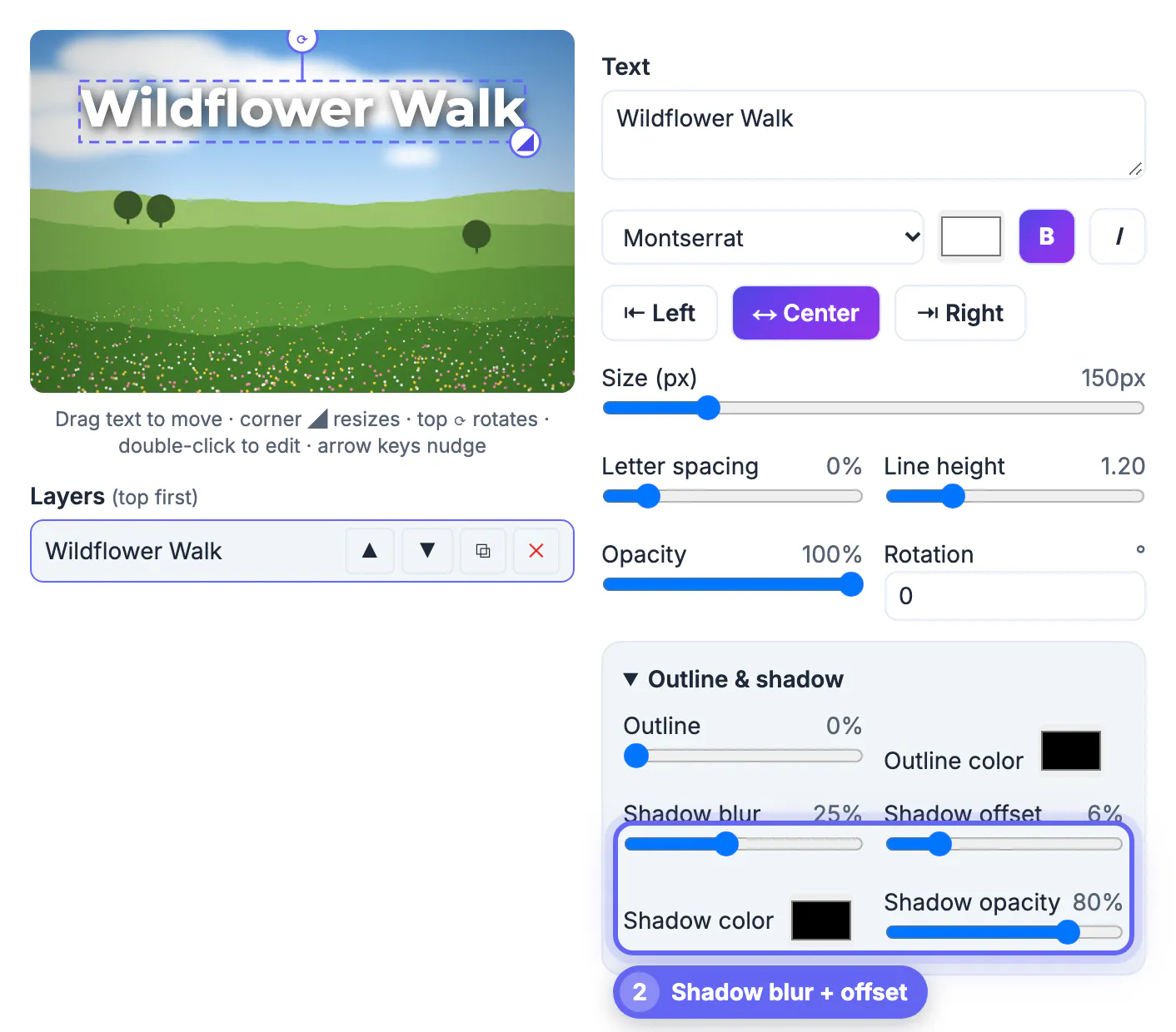
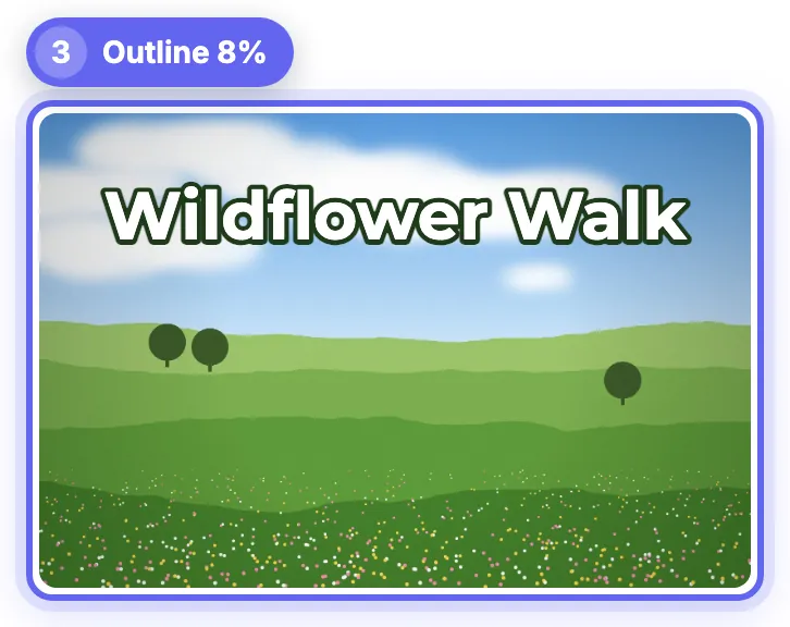
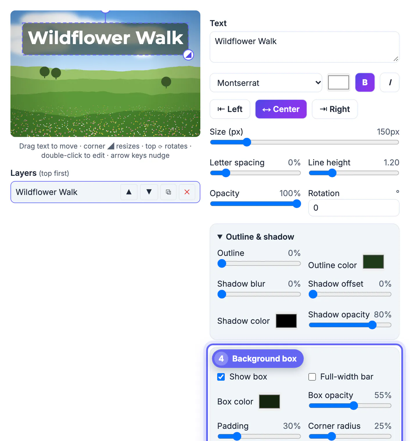
To keep text readable on a busy photo, separate the letters from whatever is behind them: a soft shadow for light separation, an outline for crisp edges on any background, or a semi-transparent box when the picture is very bright or detailed. Picking a bolder font and a larger size helps too, but contrast does most of the work. We tested all three on a meadow photo with bright white clouds, where a plain white title in Montserrat bold partly disappeared. In GrabCast Add Text to Image a shadow with 25 percent blur and 6 percent offset made it legible, an 8 percent dark green outline made it crisp, and a dark box at 55 percent opacity made it read at a glance. This guide explains when each technique fits, the settings to start from and the mistakes that make text look cheap.
🔤 Try Add Text to Image now — freeOpen →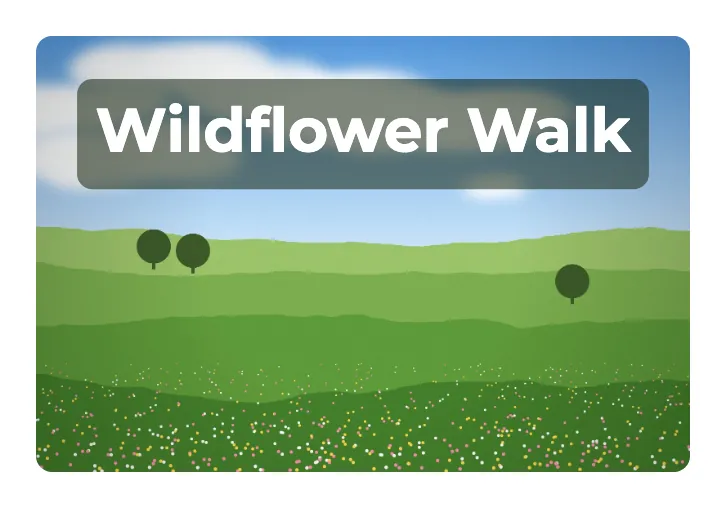
People scroll past images in about the time it takes to read three or four words. If part of a headline dissolves into a cloud, a snowy slope or a patterned wall, the eye has to work to fill the gap, and most viewers simply do not. Busy photos are the norm rather than the exception: skies change brightness from top to bottom, foliage mixes light and dark in every square inch, and city scenes add signs and windows. A plain color that looks fine over one part of the image fails a few centimeters away. Separating the text from the background, instead of hunting for an empty corner, lets you place words where they belong and keeps them legible when the image is shown small on a phone.
Why white text disappears on busy photos
Legibility depends on the difference in brightness between the letters and the pixels right behind them, not on the photo's average.
- Bright skies, clouds, snow, sand and white walls are close to the brightness of white text, so strokes that cross them vanish.
- Grass, leaves, crowds and fabric patterns are not bright but noisy; thin letters get lost among the edges.
- Text that crosses a boundary, half on sky and half on hills, needs a treatment that works on both parts at once.
- Screens shrink images: a title that reads at full size on a laptop may be 10 percent of that width in a social feed.
Shadow, outline or box: what each one does
All three live in the Outline and shadow and Background box panels of the selected text layer, and each is measured as a percentage of the font size so it scales with the text.
- Soft shadow: Shadow blur 20 to 30 percent with a small offset and 60 to 80 percent opacity creates a dark halo. It keeps the letter shapes clean and looks natural, but it only helps where the halo is darker than the background.
- Outline: 6 to 10 percent in a dark color gives every stroke a crisp edge that holds up on light, dark and mixed areas. Pick a color from the photo, such as a deep green on a meadow, rather than pure black for a less heavy look.
- Background box: Show box with 50 to 65 percent opacity, some padding and a small corner radius puts a calm field behind the text. It is the safest choice for long lines, thin fonts and very bright photos.
- Full-width bar stretches the box across the image, like a caption strip on the news; use it for subtitles along the bottom.
Settings that keep text readable at small sizes
Contrast treatments work best on top of sensible type choices.
- Use a bold, simple font such as Montserrat, Inter or Archivo Black for titles; thin scripts need a box to survive on a busy background.
- Keep titles short, three to six words, and size them so the text spans about half to two thirds of the image width.
- Leave letter spacing at 0 for bold sans fonts; wide spacing breaks words into separate letters on noisy backgrounds.
- Check the result at phone size: zoom out in your browser or view the download on your phone before posting.
- For accessibility, repeat the important words in the post text or alt text, because text inside an image cannot be read by screen readers.
Check the result with the Color Contrast Checker, and view it small with the Thumbnail Legibility Checker.
Making the change in Add Text to Image
Every setting applies to the selected layer and can be undone with Ctrl+Z, so experimenting costs nothing.
- A new text layer starts with a light outline and shadow already on; turn both to 0 first if you want to compare techniques from a plain start, as we did.
- Drag the text onto the busiest part of the photo while you test, since that is where a treatment has to prove itself.
- Try the shadow, then the outline, then the box, and keep the lightest option that still reads at phone size.
- Download as JPG for photos or PNG for graphics; the image is exported at its full original resolution, 1600 x 1067 pixels for our meadow.
Step-by-step
Common mistakes to avoid
Pro tips
Frequently asked questions
How do I make text readable on a busy background?
Add contrast directly around the letters: a soft shadow, a dark outline of 6 to 10 percent of the font size, or a semi-transparent background box. Bold, simple fonts and short lines help as well.
Is an outline or a shadow better?
An outline gives crisp edges on any background and is best when text crosses light and dark areas. A shadow looks softer and more natural but helps only where the halo is darker than the photo.
What opacity should a text background box have?
Start around 50 to 65 percent. Lower values let more of the photo show; higher values improve contrast but can feel heavy.
Does the tool reduce my photo's resolution?
No. The preview is scaled for the screen, but the download is rendered at the photo's original size.
Is my photo uploaded when I add text?
No. The photo is drawn and exported in your browser. Only the font files are downloaded from a font library when you pick them.
White text vanishes over bright, busy areas because the letters and background are too alike. Add separation with a soft shadow, a crisp 6 to 10 percent outline or a semi-transparent box, choose a bold font, check at phone size, and your words will read wherever you put them.
Related guides
Browse more: all image guides · Add Text to Image