Poster Effect for Photos: Flat Tones, Duotone, Big Prints
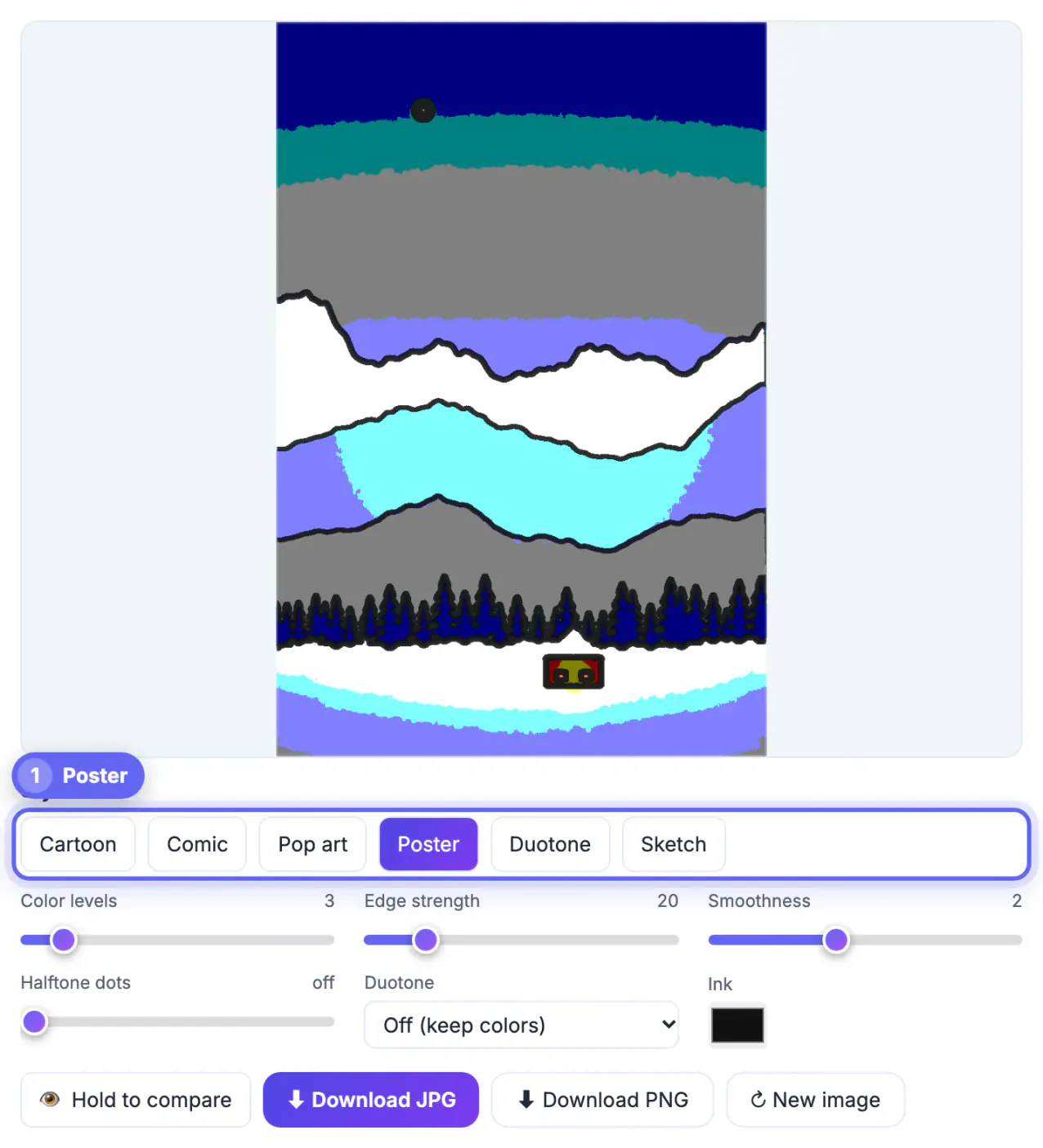
A poster effect reduces a picture to a handful of flat tones, the way a screen printer separates an image into a few ink layers, so it reads from across a room. To add it free, drop an image into the GrabCast Cartoon and Comic Effect, click the Poster preset (3 color levels, edge 20, smoothness 2) or Duotone for a two-ink look, and download a full-resolution file. This guide is written for people making things that hang on walls: a garage band's gig flyer, a farmers market sign, a school play announcement, a framed print of a favorite trail. You will see how to prep the image, how many tones suit each job, how to match a two-color print to your own brand colors, and how big you can print before it goes soft.
🖍️ Try Cartoon & Comic Effect now — freeOpen →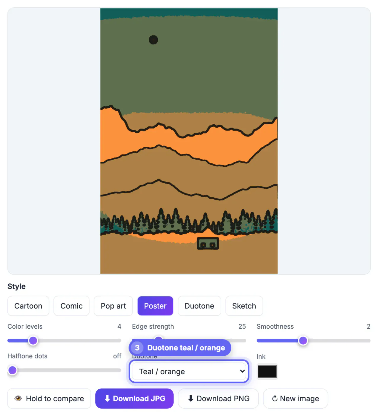
A flyer on a coffee-shop corkboard competes with thirty others and gets maybe two seconds of attention from someone walking past. Continuous-tone pictures turn into mush at that distance, while a few large blocks of solid color hold their shape. That is why rock-show posters, national park prints and campaign art so often use posterized imagery. Flat tones also print better on office printers and copy-shop stock, which struggle with smooth gradients and tend to band them anyway. And because the style looks deliberate, it hides the flaws of an ordinary phone picture: uneven light, slight blur and a cluttered backdrop all get simplified into shapes.
Prep the image before you add the poster effect
Posterizing magnifies contrast, so small problems in the source become big blotches. Five minutes of prep separates a striking print from a smudge.
- Raise contrast first. In the free Photo Editor, push contrast up a notch and pull brightness slightly down; stronger separation gives the tone levels clean borders.
- Simplify the scene. Crop stray objects at the edges and, if the subject sits in front of a messy wall, swap in a plain backdrop with the Background Remover.
- Check faces. Posterizing can split a face into odd patches when half of it sits in shade. Even light or one clear light source both work; dappled light under trees rarely does.
- Leave room for type. Frame the subject to one side or low in the frame so the band name, date and venue have a calm area to sit on.
Choosing tone levels and a duotone palette
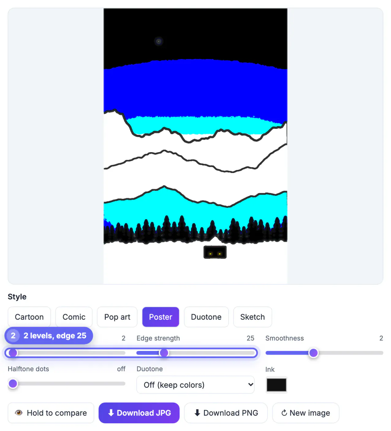
The Color levels slider (2 to 12) rounds each red, green and blue channel to that many steps. The count grows fast: 2 levels allow 8 possible colors, 3 allow 27, 4 allow 64. Fewer levels mean a louder result.
- 2 levels: stark, almost a stencil. Great for a punk show flyer or a T-shirt mockup; too harsh for portraits of relatives.
- 3 levels, the Poster preset: the classic gig-poster look, with a light, mid and dark version of each color.
- 4 to 5 levels: still stylized but kinder to skin tones, a good choice for a framed family hike or pet print.
- Duotone: instead of rounding your colors, it maps brightness to steps between two inks. Presets include navy and cream, pink and yellow, noir red, teal and orange, and forest and mint; Custom lets you type any shadow and light color, such as your band's merch colors or a school's navy and gold.
Keep edge strength around 15 to 30 for this look; a high number draws only thin outlines, which reads as comic art, and zero turns lines off. Smoothness at 2 blurs away grain before the tones split, so flat areas stay flat. For a hand-pulled screen-print texture, add halftone dots at 4 to 6 pixels on top of Poster or Duotone.
How large you can print the poster effect
The download is rendered from your original at up to 4,000 pixels on the long side, while the on-screen preview is only 1,100 pixels to keep the sliders quick. That export size decides your print size, so do the math before paying for printing.
- Half-letter handbill (8.5 inches tall): 4,000 pixels gives about 470 pixels per inch, far more than needed.
- Letter size (11 inches tall): about 360 pixels per inch, sharp even up close.
- Tabloid 11 by 17: about 235 pixels per inch, comfortably inside the 150 to 300 range print shops ask for.
- 18 by 24 inch poster: about 165 pixels per inch from a 4,000-pixel file; flat tones hide softness well, but add the AI Image Upscaler if the shop insists on 300.
- Start from the camera original. A 1,200-pixel image from a website stays 1,200 pixels; the tool never enlarges.
Download PNG for print so the borders between tones stay crisp; the 92 percent quality JPG is smaller and fine for social posts and email.
Setting type and matching colors
The effect handles the image only; it does not place text. Set type in any layout app, such as Canva, Google Slides or Word, using the downloaded art as the background.
To make lettering belong, open the finished art in the Color Palette tool, which pulls the dominant colors and gives exact HEX codes. With a custom duotone it is even simpler: reuse the two HEX values you typed, shadow color for the headline and light color for a text panel. Stick to one bold typeface plus one plain one, keep the essential facts (what, when, where) near the top, and test by viewing the flyer at 25 percent zoom: if you can still read the date, people walking past can too.
Everything runs locally in your browser. The image is never uploaded, your last edit is restored if the tab closes, and the download has no watermark, which matters when the art is for a client or a paid gig.
Step-by-step
Common mistakes to avoid
Pro tips
Frequently asked questions
What is the difference between the Poster and Duotone presets?
Poster rounds your picture's own colors to 3 levels per channel with light outlines. Duotone ignores the original colors and maps brightness to 5 steps between two inks, navy and cream by default.
Can I choose my own two poster colors?
Yes. Set Duotone to Custom and pick a shadow color and a light color, for example your school's navy and gold. You can also change the outline ink color separately.
Is it good enough for a professional print shop?
Usually. A 4,000-pixel export gives about 235 pixels per inch at tabloid size. For 18 by 24 inches and up, upscale first or accept a slightly softer print.
Do I need an account, and is there a watermark?
No account and no watermark. The work happens in your browser tab, and your last image and settings are kept locally so you can come back to them.
Can I use gig or event art I made commercially?
The stylized result is your edit, but the underlying image rights still apply. Use pictures you shot or licensed, and get permission from recognizable people on paid promotions.
Strong contrast in, 3 tone levels or a two-color duotone, light outlines, a full-resolution PNG out and honest math on print size: that is the whole recipe for a poster that reads from across a room.
Related guides
Browse more: all image guides · Cartoon & Comic Effect